Finding Your Way Home

New Signs Animate Campus
While campus will always feel like home, the next time you visit you’ll notice some handy new directional signs in case you’re rusty on where the entrance to the Senior Common Room is, or you graduated before the place you knew as the COOP became the Dodig Family COOP.

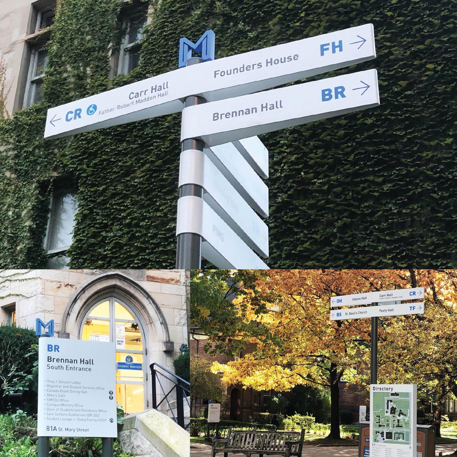
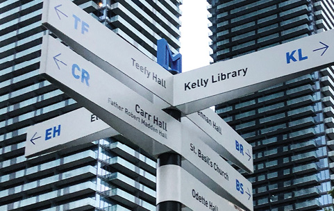
Slim wayfinding signs known as fingerblades, complete with a distinctive M now point out the path to various campus locations while larger signs outside each building bear the same large M, to indicate a St. Michael’s property. Including campus maps you’ll soon find a total of 33 of the new-look signs around campus.
A committee of university staff and faculty, chaired by St. Michael’s Bursar and Chief Administrative Officer Effie Slapnicar, and ably assisted by Project Coordinator Elena Marenco, spent months working on the project, deciding that the M would be a subtle but powerful indicator of pride of place.

The single letter suggests solidarity and transparency. And while it echoes the collegial M, this version distinguishes itself by having no serifs, the small strokes tacked on at the tops and bottoms of letters, so as not to be confused with the M used for years on St. Michael’s sports uniforms.
The simple design both respects and complements the university crest, and reflects the understated architectural approach on campus, nicely capturing the ways in which St. Mike’s is rooted in tradition while offering a modern take on everything from programming to presentation.

Featured image: Brennan Hall greets students and visitors with a prominent sign detailing the services found within. Accessible entrances are clearly marked.
